Content settings
| Settings | Description |
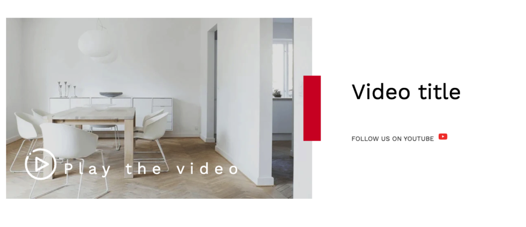
| Image | This is the main image of the video section. |
| Image height | Adapt to image: Uses the aspect ratio of the collection images is cropped. Small: This is the smallest height of the lookbook image. Desktop height: 314px, Mobile height: 194px Medium: This is the medium height of the lookbook image. Desktop height: 500px, Mobile height: 300px Large: This is the maximum height of the lookbook image. Desktop height: 695px, Mobile height: 435px |
| Desktop image placement | Image first: Displays the image on the left. Image second: Displays the text on the left. The image first is the default mobile layout. |
| Overlay opacity | You can add an overlay on the image from 0 to 100%. |
| Heading | RichText: This is the heading for the lookbook section. Learn more about RichText Editor |
| Heading size | Large: This is the large text size of the section heading. Desktop size: 50px, Mobile Size: 30px Medium (Default): This is the medium text size of the section heading. Desktop size: 40px, Mobile Size: 28px Small: This is the medium text size of the section heading. Desktop size: 32px, Mobile Size: 25px |
| Content | This is the text for the video section. |
| Button label | This is a button for a single slide. Leave the label blank to hide the button. |
| Button link | This is a link for the button. |
| Button style | Primary: Use a solid background button style Secondary: Use outline button style |
| Button size | You can change the button size follow the options, (Large, medium, small) |
| Color scheme | This is a color scheme option to change the color of the section |
Video settings
| Settings | Description |
| URL | You can add YouTube or Vimeo video URLs. |
| Video alt text | This ALT test for the video. Describe the video to make it accessible for customers using screen readers. |
| Mute video | You can mute/unmute video sound. |
| Play button text | This is the text of the play button text. |
| Text color | You can change the color of the play button text. |
| Play button position | You can change position follow the options, – Top left – Top right – Bottom left (default) – Bottom right – Center NOTE: Position is automatically optimized for mobile. |
| Make section full width | You can display images and content full width in a section container. |
| Round Corner | If you enable it, the section corners will be rounded. |
Section padding
| Settings | Description |
| Desktop: Padding top | The section’s top inner space height is determined. From 0 to 150 px, will be incremented by 5px. It will affect the desktop. |
| Desktop: Padding bottom | The section’s bottom inner space height is determined. From 0 to 150 px, will be incremented by 5px. It will affect the desktop. |
| Mobile: Padding top | The section’s top inner space height is determined. From 0 to 150 px, will be incremented by 5px. It will affect the mobile. |
| Mobile: Padding bottom | The section’s bottom inner space height is determined. From 0 to 150 px, will be incremented by 5px. It will affect the desktop. |


