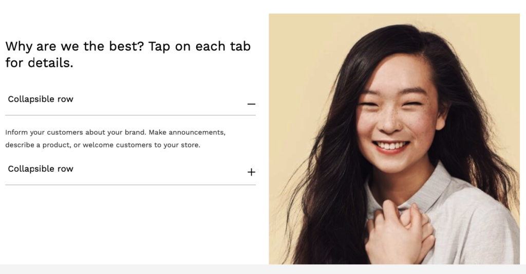
| Settings | Description |
| Heading | RichText: You can add a collapsible title using the RichText editor. Learn more about this |
| Heading size | Large: This is the large text size of the section heading. Desktop size: 50px, Mobile Size: 30px Medium (Default): This is the medium text size of the section heading. Desktop size: 40px, Mobile Size: 28px Small: This is the medium text size of the section heading. Desktop size: 32px, Mobile Size: 25px |
| Show image | You can show/hide the image from this section. |
| Image | This section’s image can be shown or hidden. |
| Image height | Adapt to image: Uses the aspect ratio of the collection images is cropped. Small: This is the smallest height of the lookbook image. Desktop height: 500px, Mobile height: 304px Large: This is the maximum height of the lookbook image. Desktop height: 600px, Mobile height: 435px |
| Round corner | If you enable it, the section corners will be rounded. |
| Desktop image placement | Image first: Displays the image on the left. Image second: Displays the text on the left. It will work only for the desktop device. |
| Make the section full width | You can display images and content full width in a section container. (It works when the image is disabled) |
| Color scheme | This is a color scheme option to change the color of the section |
| MOBILE SETTINGS | |
| Mobile image placement | Image first: Displays the image on the left. Image second: Displays the text on the left. It will work only for mobile devices. |
Collapsible row
| Settings | Description |
| Heading | This is heading for a single collapsible row. |
| Description | This is the description of a single collapsible row. |


