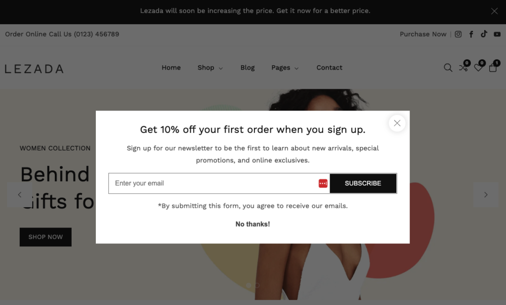
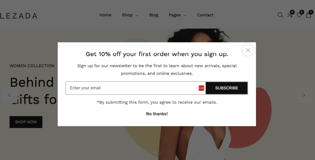
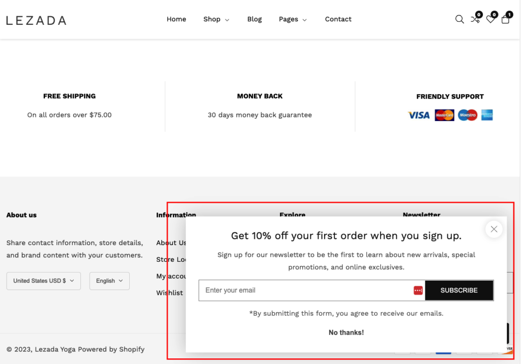
The appearance of the popup
| Settings | Description |
| Display mode | Enable: If you enable it. The popup will enable in your store. Disable: If you disable it. The popup will be disabled in your store. Testing: The ‘Testing mode’ popup appears regardless of the relevant settings or dismissal, allowing you to review it at any time. When you’re satisfied with the appearance, click the ‘Enable’ button. |
| Show on home page only | Allows for a popup only for the homepage. |
| Show only for visitors | If a visitor creates an account in your store. This popup will not be displayed to the customer. The popup will be displayed only for visitors. |
| Delay time showing popup | After your website has loaded, you can choose a time when the popup should appear. The range is 2 sec to 60 sec. |
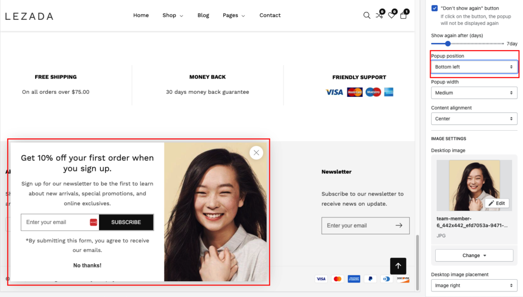
| “Don’t show again” button | When a customer will get the popup for the first time. If the customer will click on this button, the popup will not be displayed again for the specific customer. |
| Show again after (days) | After clicking on this “Don’t show again” button, How long days will the customer see the popup again? |
| Popup width | Small: This is the smallest width of the popup. Desktop width: 500px, Mobile width: 100% with a 50px offset Medium (Default): This is the medium width of the popup. Desktop width: 750px, Mobile width: 100% with a 50px offset Large: This is the highest width of the popup. Desktop width: 1000px, Mobile width: 100% with a 50px offset |
| Content alignment | Left: Aligns the content to the left. Right: Aligns the content to the right. Center: Aligns the content to the center. |
Popup position Settings
Center:
Bottom right:
Bottom left:
Popup Image Settings
| Settings | Description |
| Desktop image | This is an image for the popup. |
| Desktop image placement | Image left: You can show the image as left side of the popup. Image right: You can show the image as right side of the popup. |
| Show as full-width image in background | You can show as full width image in background of the popup. By default, it’s disabled. |
| Overlay opacity | It works by selecting the show as a full-width image in the background. You can add overlay opacity. |
Colors settings
| Settings | Description |
| Background | This is the background color of the popup. |
| Text | The is the all text color of the popup. |
| Button background | This is the background color of the subscribe button |
| Button text | This is the text color of the subscribe button |
| Button hover background | This is the hover background color of the subscribe button |
| Button hover text | This is the hover txt color of the subscribe button |


