Product template #
Breadcrumbs
| Settings | Descriptions |
| Show breadcrumbs | Show a set of links that tells the customer where they are on the site, and allows them to return to a previous page. You can show/hide the breadcrumbs on the product page. |
Media settings
Learn more about media types.
| Settings | Description |
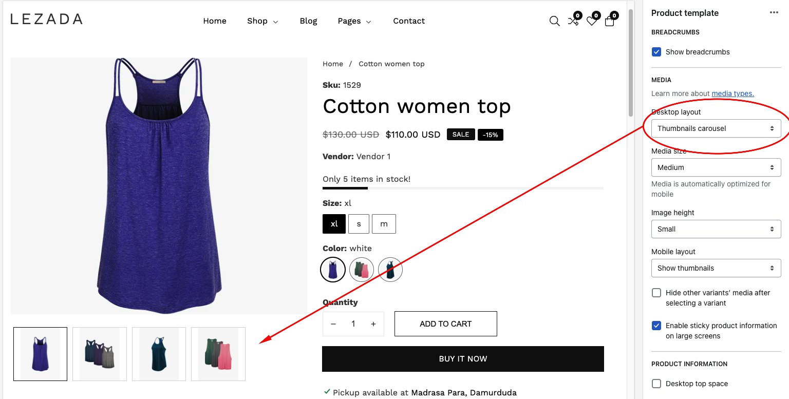
| Desktop media position | Right (default): Displays the image on the right and text on the left. Left: Displays the image on the left and text on the right. The position is automatically optimized for mobile. |
| Desktop layout | Stacked: ——————–  Thumbnails: ———————-  Thumbnails carousel: ————————————  |
| Media size | Small: The image will display in one-third of the entire section width. Medium: The image will be displayed at half the width of the entire section. Large: The image will display in two-thirds of the entire section width. Media is automatically optimized for mobile |
| Image height | Adapt to image: Uses the aspect ratio of the collection images is cropped. Small: This is the smallest height of the lookbook image. Desktop height: 500px, Mobile height: 304px Medium: This is the medium height of the lookbook image. Desktop height: 600px, Mobile height: 384px Large: This is the maximum height of the lookbook image. Desktop height: 700px, Mobile height: 435px |
| Mobile layout | |
| Hide other variants’ media after selecting a variant | Images of other variants are hidden from view when one variant is selected. When the variant is deselected, the images reappear. |
| Enable sticky product information on large screens | You can enable sticky product information on the large screen. |
| Enable video looping | Allows for repeat playback of the video. The replay must be initiated by a customer click. |
Product information top offset
| Settings | Description |
| Desktop top space | You can enable the top offset of the product page content. |
Sticky cart
| Settings | Description |
| Enable | As customers browse and scroll, keep the add-to-cart button visible. |
Section blocks
You can add the following blocks to your Featured product section in your store:
| Text | Text: You can add text and dynamic sources. Text style: Choose between Body, Subtitle, or Uppercase. |
| Title | Displays the title of the product. |
| Price | Displays pricing information for the product, such as price and comparison at price. |
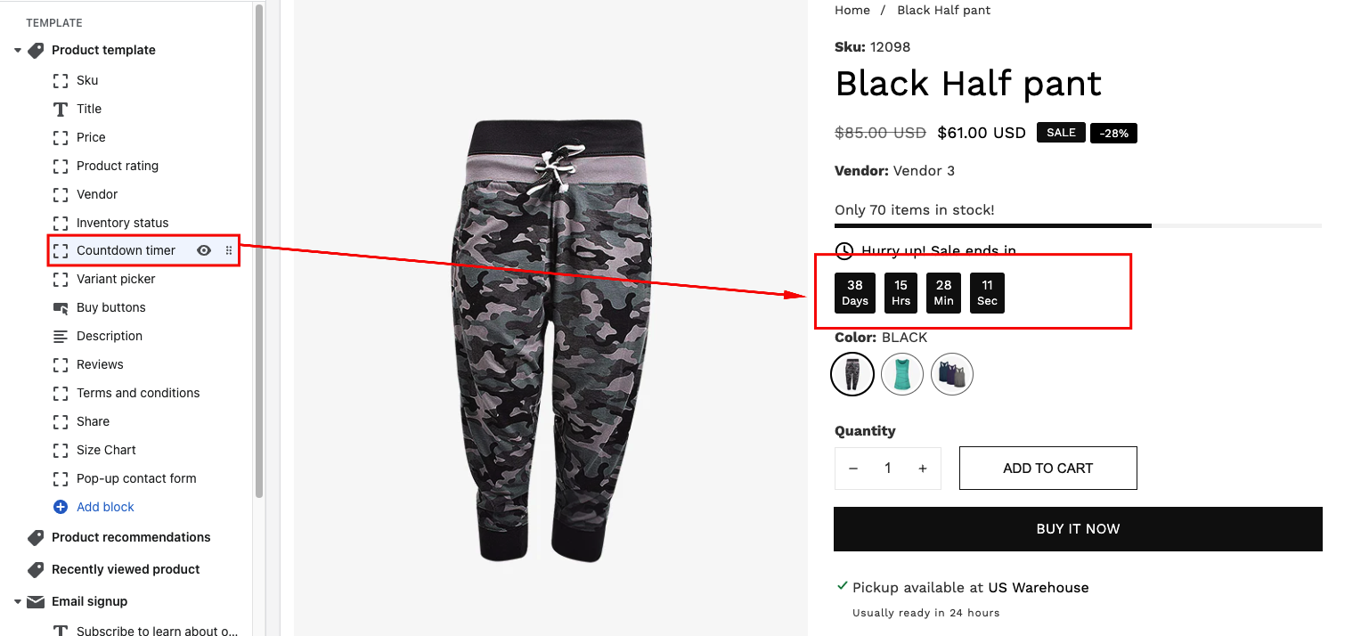
| Countdown timer |  Displays an active countdown clock set to expire at a given time. For example, You can give a discount for a specific product. Then the timer will present a discount period. To display the counter timer, you must set up the meatfield. Learn more about adding countdown metafield |
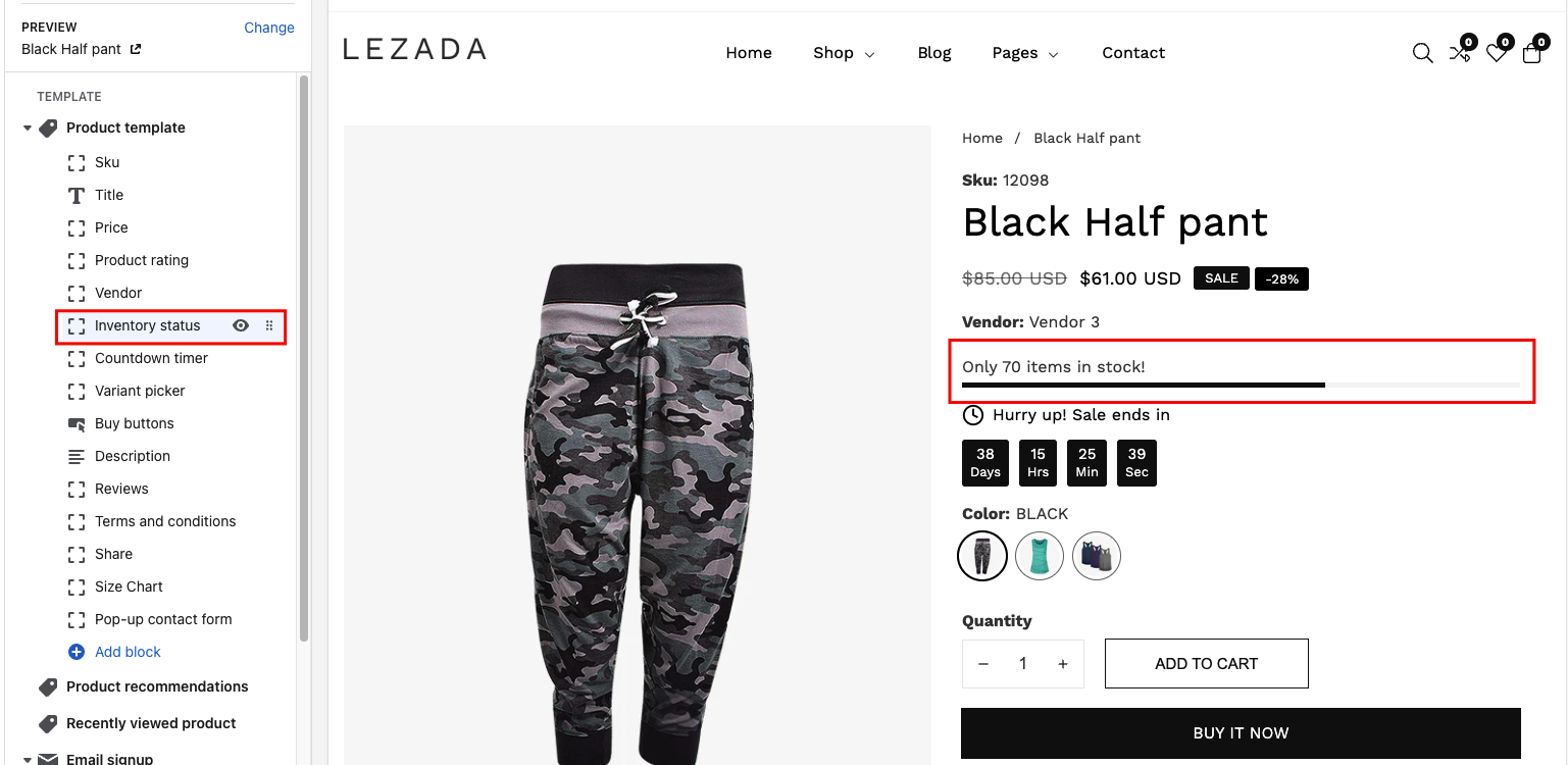
| Inventory status |  Displays a message informing customers about product availability: |
Variant picker


